With companies that have way too many SKUs, you have to be a bit more flexible.
 Manolo SandovalWorldwide Creative Services Director @ ex-Tupperware Brands
A global brand can publish a dozen communications in one week and still look like a dozen unrelated companies. Without recognition cues that stay constant and guidelines that say what may change, every regional team and agency makes its own reasonable choices, and the sum reads as incoherence. Over-correcting produces a rulebook so rigid that a new product is indistinguishable from the one beside it on the shelf. Marketing leaders at companies with broad catalogs have to avoid both outcomes, and they often need a finance-led organization to pay for the fix.
Manolo Sandoval, former Worldwide Creative Services Director at Tupperware Brands, spent 21 years in advertising agencies, including BBDO Mexico, Leo Burnett and TBWA, before building Tupperware's in-house creative agency from zero. He inherited a brand used in roughly 70 countries with no consistent typography, layout or logo color, and he later led the effort to turn a rebrand into guidelines the whole company could deploy. His work on Pedigree, a Mars pet food brand, showed him the opposite failure, a system that allowed almost no movement. Both experiences shape his view of what a brand system should lock down and what it should leave open.
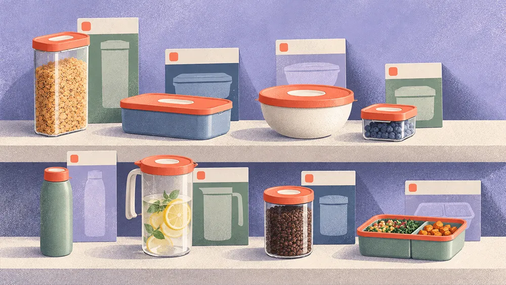
"When you see all the products, you feel that they're kind of like cousins, but they're not twins," Sandoval says. Getting there at Tupperware meant first working out which cues every product had to share.
Two ways guidelines fail
Sandoval's reference point is Mars, whose pet food brands use color as a memory cue. Pedigree dog food is yellow and Whiskas cat food is purple, and customers learn those signals well enough to recognize the brand in seconds. When he arrived at Tupperware, the brand had no equivalent. "Everything was different. The typography was different, the layouts were different," he says. "It seems like they were completely different companies."
He sees two usual causes for that outcome. A young company is still experimenting and keeps whatever engages best before it consolidates. An older company often has weak guidelines or none, so each team fills the gap with its own judgment.
Rigid guidelines fail in the opposite direction. On Pedigree line extensions, Sandoval says, the rules left no room to maneuver. "You couldn't move anything," he recalls. Typography and background stayed identical, so shoppers could take a new product for one they already knew.
His fix is a guideline that signals novelty and ownership together. A line extension should be able to "move a little bit so you recognize that something is new," Sandoval says, and still read as Pedigree.
Cousins at catalog scale
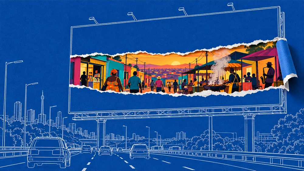
In Sandoval's framework, the wordmark, the typography and the voice stay fixed, while background color and photography style are free to move. Nike is his example of how far the rest can move. "It could be a very colorful background or it could have some other stuff depending on the line of the product," he says. "But the logo, it's always kind of consistent." The fixed cues matter most on out-of-home placements, where a viewer may give a billboard or transit panel only a few seconds. Photography changes on a schedule. "The photography style can be changing from season to season," he says. A brand can commit to one look for two or three years, then refresh it to follow trends while everything else stays put.
Apple shows why range matters. Its layouts stay close to identical, with a black or white background, opposite-color type and a large product shot, and its narrow product line lets that work. A catalog of roughly 70 SKUs can't copy it. "With companies that have way too many SKUs, you have to be a bit more flexible," Sandoval says. His example is a color decision per line. "For this run we're going to go with some tint of green because it's our eco line. But for this one we're going to go with blue because it's the back to school line."
Voice holds the family together through an archetype, a defined brand personality. "Archetypes help because they give you a framework of, okay, this is kind of the persona that you want to be," Sandoval explains. Pedigree's archetype was the Innocent, so every line of copy had to read as if an eight-year-old had written it, and the humor could shift by market inside that frame.
Earning the seat
A system that flexes across 70 SKUs works only if the guidelines behind it cover every one of them, and Sandoval had to win a place in the room to make sure they did. After 21 years in agencies, he found that in-house creative holds a different standing. "In an ad agency you are the product, but in a company you are a tool to sell the product," he says. Tupperware's leadership came from finance, so he made his case in finance's terms, with a business case for consistency and an Excel sheet of criteria for judging vendor pitches, the format finance already works in.
Once the rebrand was underway, he asked to be invited into the process. The agency's contract called for about 20 pages of guidelines, and he worried that wouldn't reach every touch point and product line. "I just want to make sure that we have enough to work with," he explains. His team ended up building four sets of guidelines (packaging, editorial, digital and sales force) and deploying them across the company's markets. He framed the gap as something he could help fill. "Instead of saying that, no, this isn't what we wanted, I just tried to bring something to the table that I know they're not that familiar with," he adds.
The two halves of his argument meet in that gap. Fixed cues and flexible rules only hold if someone writes, funds and deploys them for the whole catalog, and Sandoval earned that role by supplying what the business hadn't thought to ask for. "It was a matter of teamwork and knowing what was the strength that I could provide to them," Sandoval concludes.