Creative really matters. It's not just about information, it's about the creative idea behind it. Using creativity to really convey strong messages is the formula.
 Ruth BernsteinCo-Founder & CEO, YARD NYC
An out-of-home buy for a public health message is usually sized by the number of passersby it reaches. Planners tend to start with the formats carrying the largest audiences and work down from there. A campaign that needs a stranger to stop, take out a phone, and scan a code is asking for more than just a passing glance. Audience and creative context tend to decide which format fits, and for a message that needs a physical response, that decision can come down to a single city block.
Ruth Bernstein co-founded the creative agency YARD NYC and serves as its Chief Executive Officer. Caroline Seklir is Head of Strategy, and she has spent more than a decade there, running strategy across its brand work. YARD is independent and female-led, and it pays for campaigns on issues it hand picks itself, using creativity, culture, and conviction to carry a message.
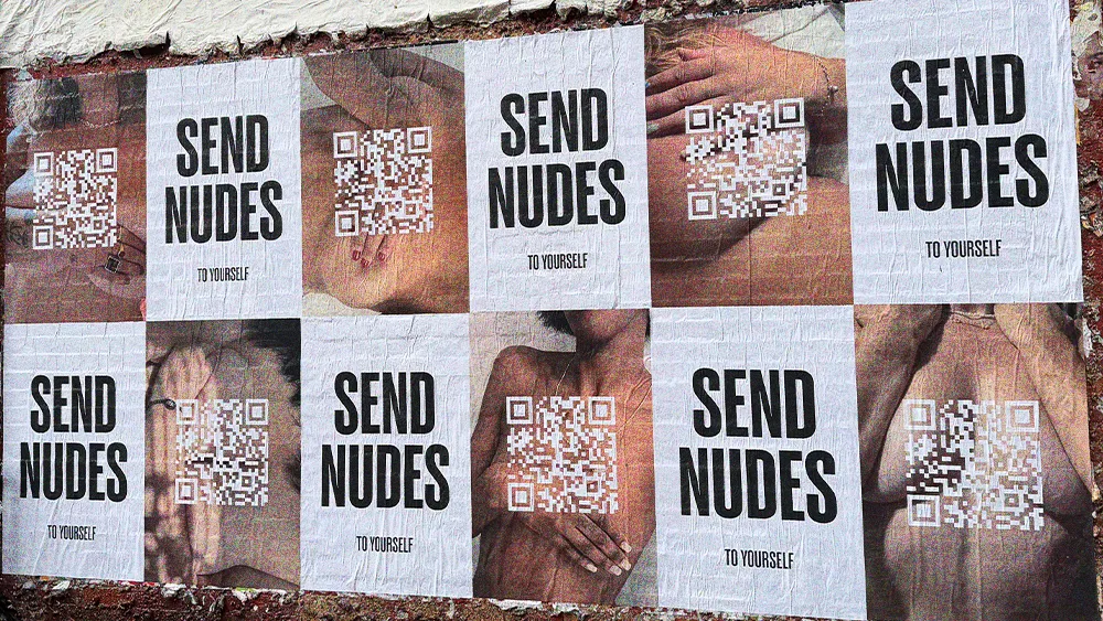
"Creative really matters. It's not just about information, it's about the creative idea behind it. Using creativity to really convey strong messages is the formula," says Bernstein. Her latest campaign is SEND NUDES, YARD's own breast health initiative, up this month on posters throughout NYC intersections in Williamsburg and the Lower East Side. The posters' provocative slogan is set above a QR code that leads to sendnudestoyourself.com. The site instructs a woman to photograph her breasts twice a year and compare the images, since a change she can see may be the first sign of cancer.
Formats to fit the schedule
YARD had two weeks to make the SEND NUDES campaign and place it, a schedule that ruled out any format a buyer has to book far in advance. Posters pasted straight onto walls could go up inside that window, and that's where YARD spent the media budget. "We did this in two weeks, and when you're moving that quickly, some of your channels are determined by that level of speed," says Seklir.
Paper also suited New York well, where a sheet on a wall lasts days. "We see things get papered up and covered over and torn down, and there's a real culture around watching and responding to those things," says Seklir. Working closely with Ulrika Karlberg, Chief Creative Officer, she says they wanted the campaign to look like the flyers New Yorkers put up themselves, the kind with a phone number to tear off at the bottom. "There's a sort of scrappiness that I think younger generations also respond to with this kind of advertising," she notes.
We are intentionally in neighborhoods where there are younger populations, where there are people who aren't going to be shy to maybe scan a QR code on something that says, 'send nudes.'
 Caroline SeklirHead of Strategy, YARD NYC
Who's on the block?
Scanning the campaign's code means stopping on a sidewalk in daylight, in front of whoever else is on the block. Seklir and Karlberg chose each block based on who walks it. The paper went up at North 7th and Bedford in Williamsburg and on the blocks around Dimes Square. "We are intentionally in neighborhoods where there are younger populations, where there are people who aren't going to be shy to maybe scan a QR code on something that says, 'send nudes,'" she says.
Large-format buys are part of their record too, and more channels have to work together on them. "There is a time and a place to do a Times Square billboard. We love to do those and we've had a lot of fun doing them," says Seklir. For this campaign, she expected the bigger formats to miss the women she wanted. "It would have felt very different if this was a marquee in Times Square. I think you immediately would have lost the audience you were looking to connect with," Seklir explains.
Bernstein talks about the photographs on the posters, and how close they sit to a passerby. "Literally the images are in your face at street level, whereas Times Square, everything's larger than life," she says. Seklir sees the same mismatch on her own commute, and a corner is how she buys relevance. "I think about the West Side Highway in New York right by my house. It's healthcare billboard after healthcare billboard, and it's for a completely different demographic," she adds.
From paper to page
The QR code on each poster opens the campaign website, and the site has seconds to explain what the campaign is before a woman closes the tab. Seklir and Karlberg made the page pink, a color already tied to breast cancer, so a visitor knows the topic before reading anything. Breast health resources follow underneath. "We don't want to bounce someone through a whole long rigmarole to understand what it's about," she says. "It's like a quick provocation, a quick scan and then there's that information you need right away at the top."
The posters are up through the end of the month, and the twice-yearly photograph they ask for is meant to outlast them. Nothing on the posters names breast health, and Seklir picked the blocks where a woman would stop to find out. "It's a surprise that we're talking about breast health," Bernstein concludes. "We're delivering very important information in a way that doesn't feel like you're eating your broccoli."